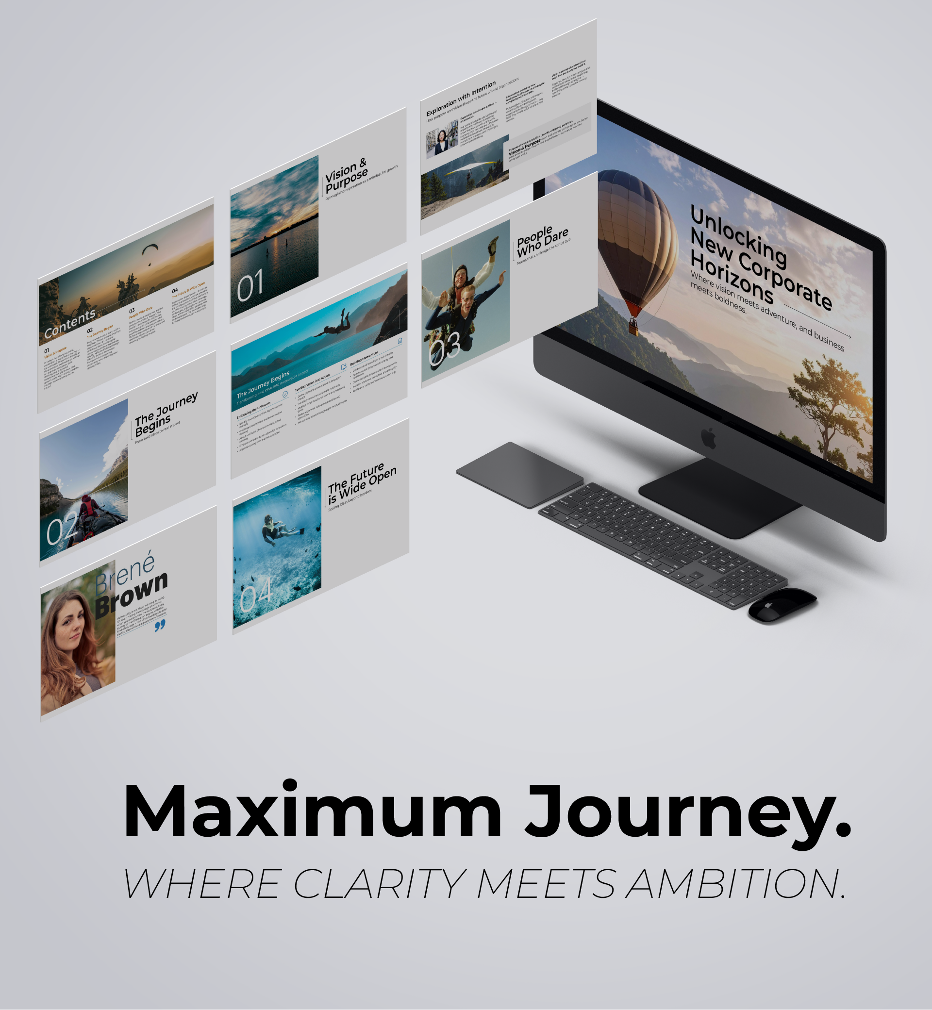
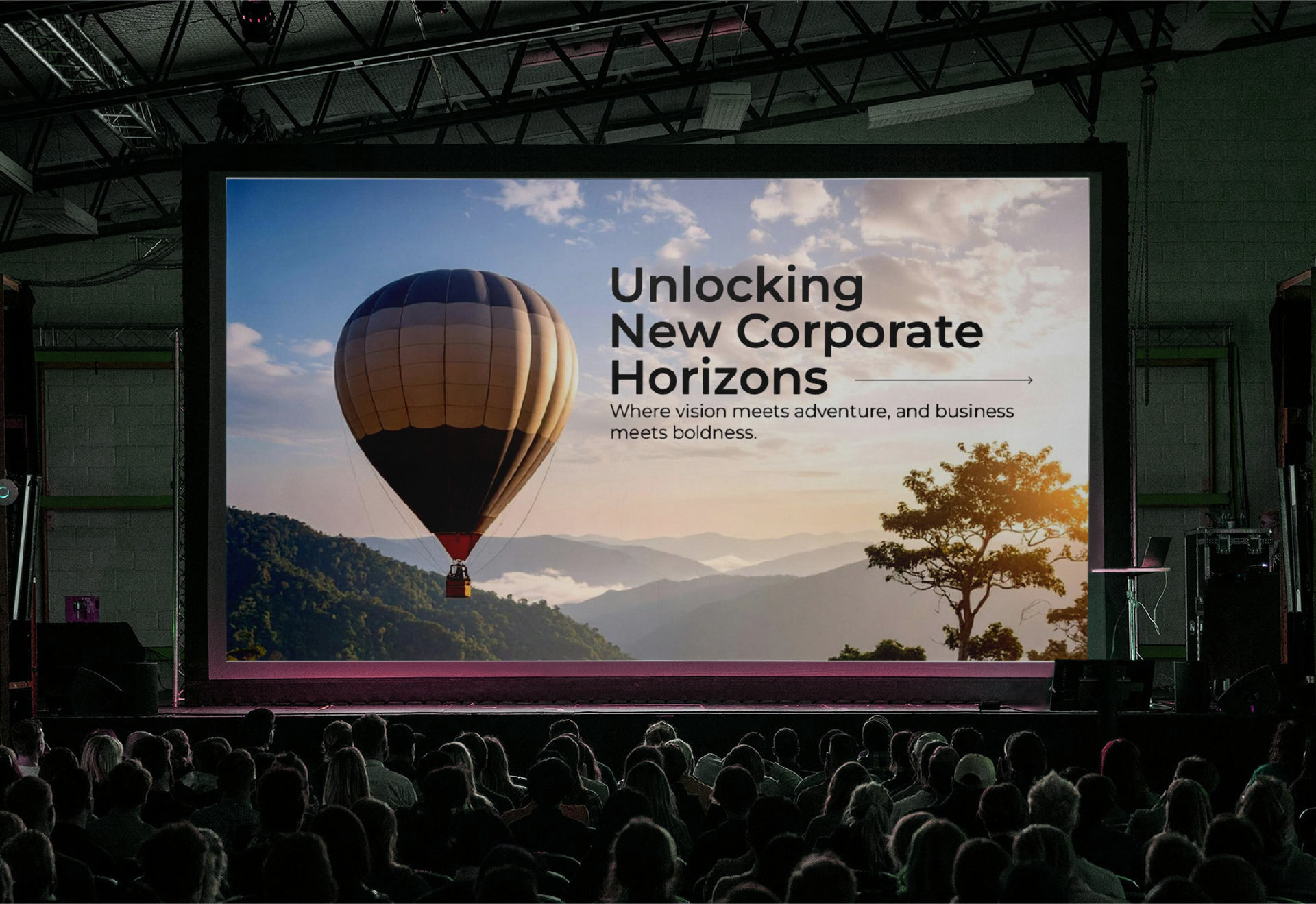
Maximum Journey
Where clarity meets ambition
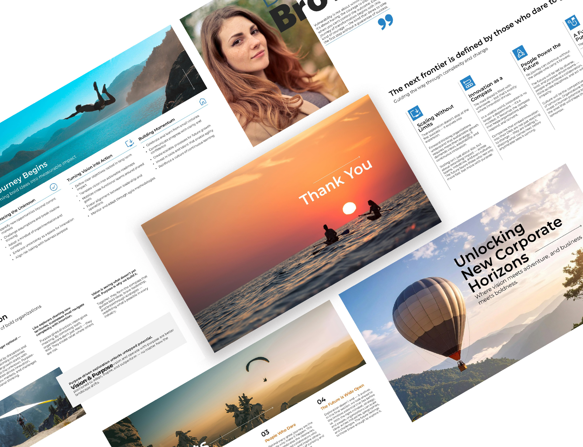
Concept
The design of this deck follows a clean, modern, and corporate visual style, aimed at delivering high-impact messaging with clarity and professionalism. The layout is structured to support an inspirational narrative centered around the theme of "exploration", balancing strategic content with emotional resonance. White space, clear hierarchy, and visual rhythm are carefully considered to guide the viewer through the presentation with ease and focus.
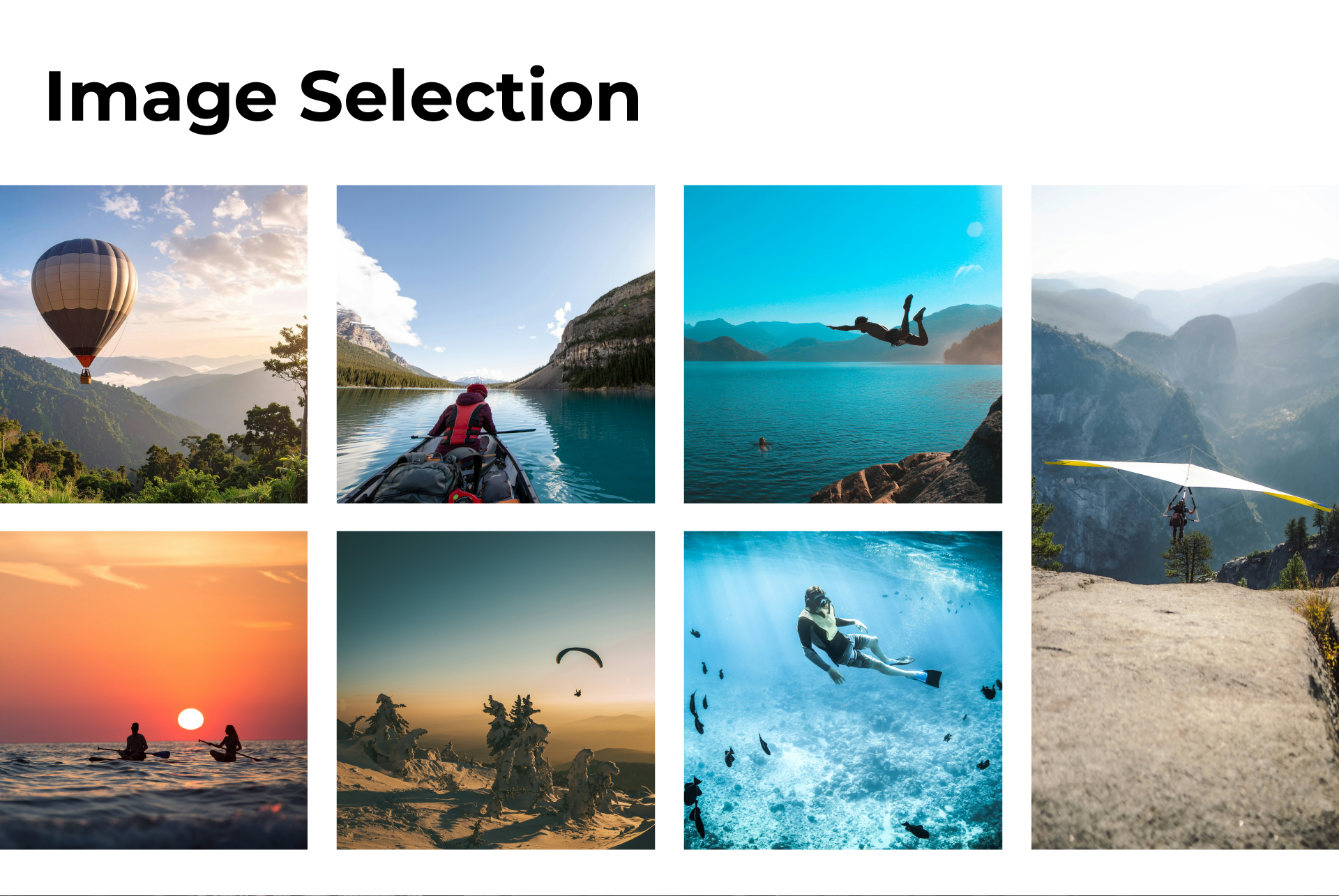
Image Selection
Images were carefully curated to convey a sense of discovery, leadership, and forward momentum. Open landscapes, extreme natural environments, and individuals in moments of challenge or reflection visually reinforce the concept of exploration — not only as physical movement, but as a mindset. These visuals inspire ambition and vision while maintaining the sophistication expected in a corporate setting.
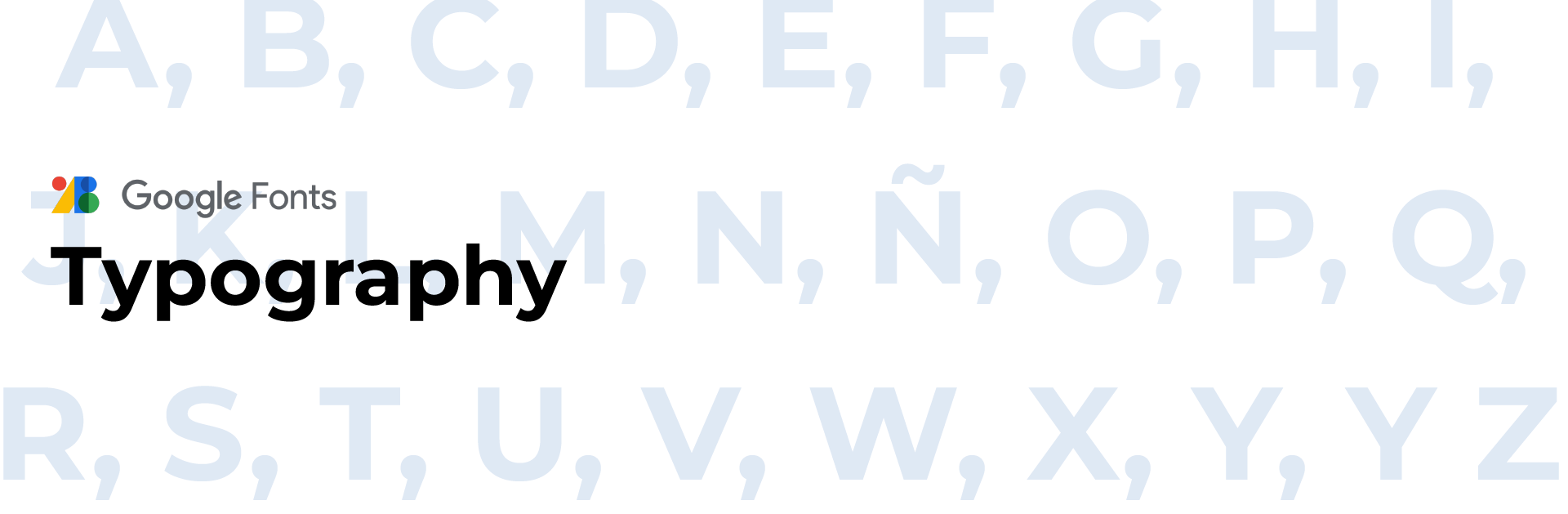
Typography
The choice of Montserrat reflects the need for a typeface that is both modern and versatile. Its geometric design offers a sense of precision and contemporary clarity, making it ideal for professional use. Montserrat performs well in both headlines and body copy, ensuring a cohesive visual identity throughout the deck while maintaining readability and visual impact.