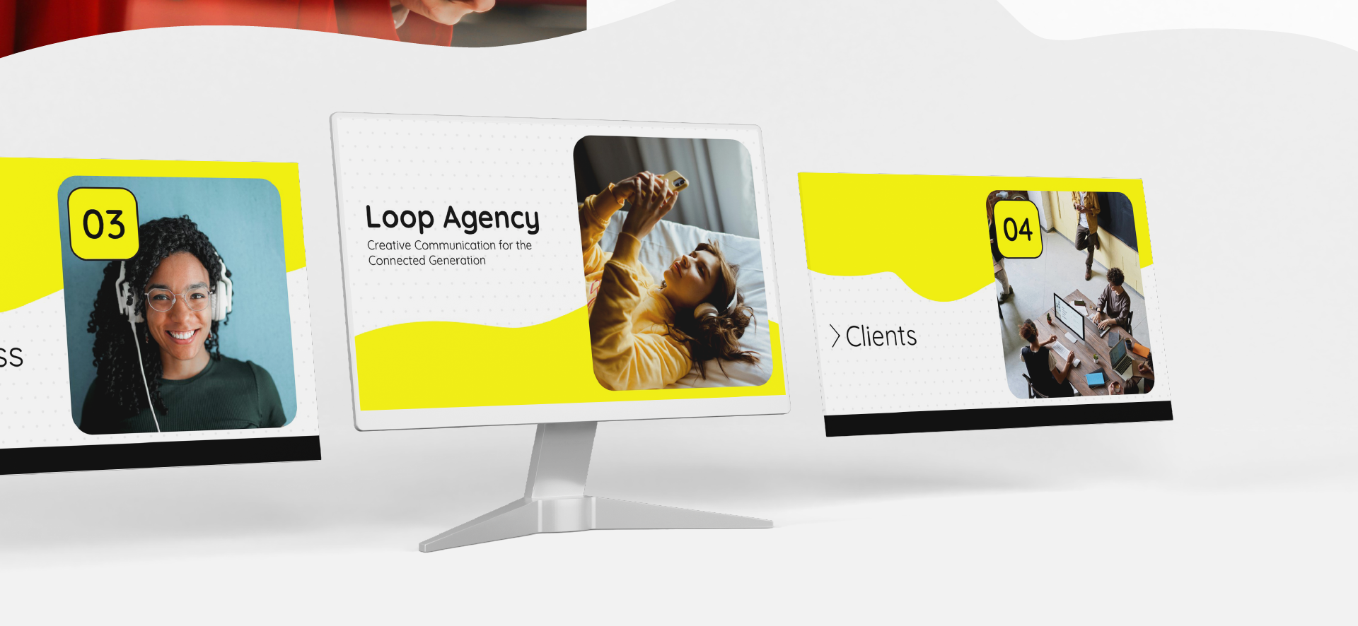
Fun Pitch Deck
Concept
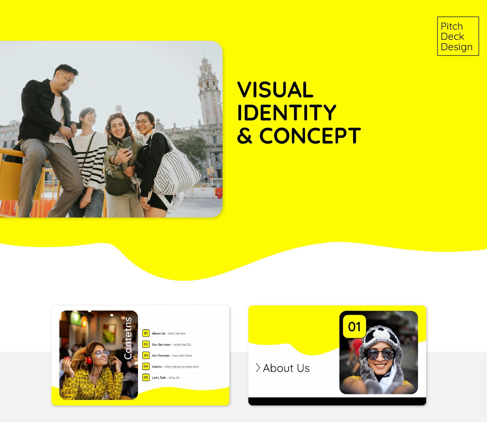
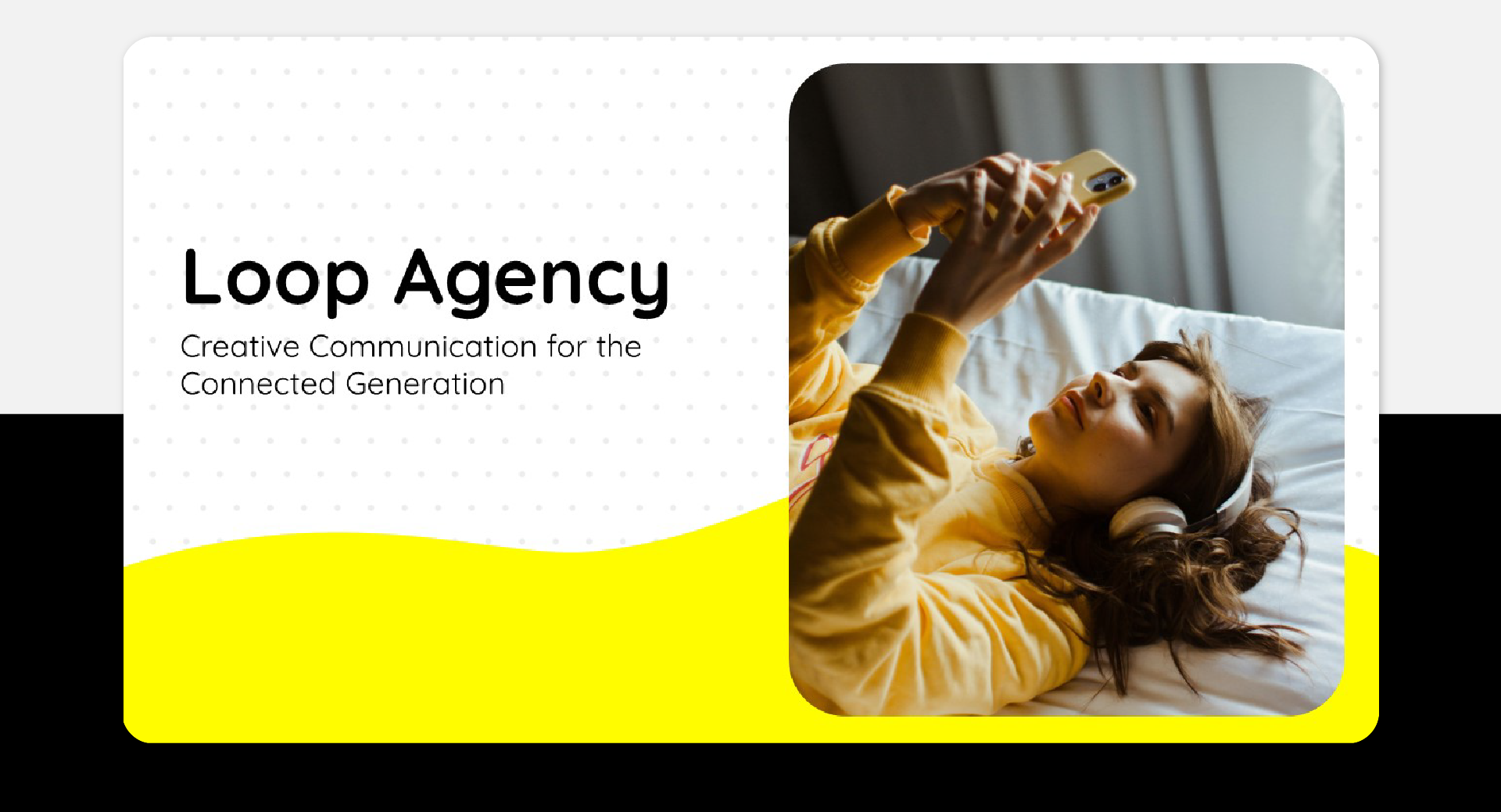
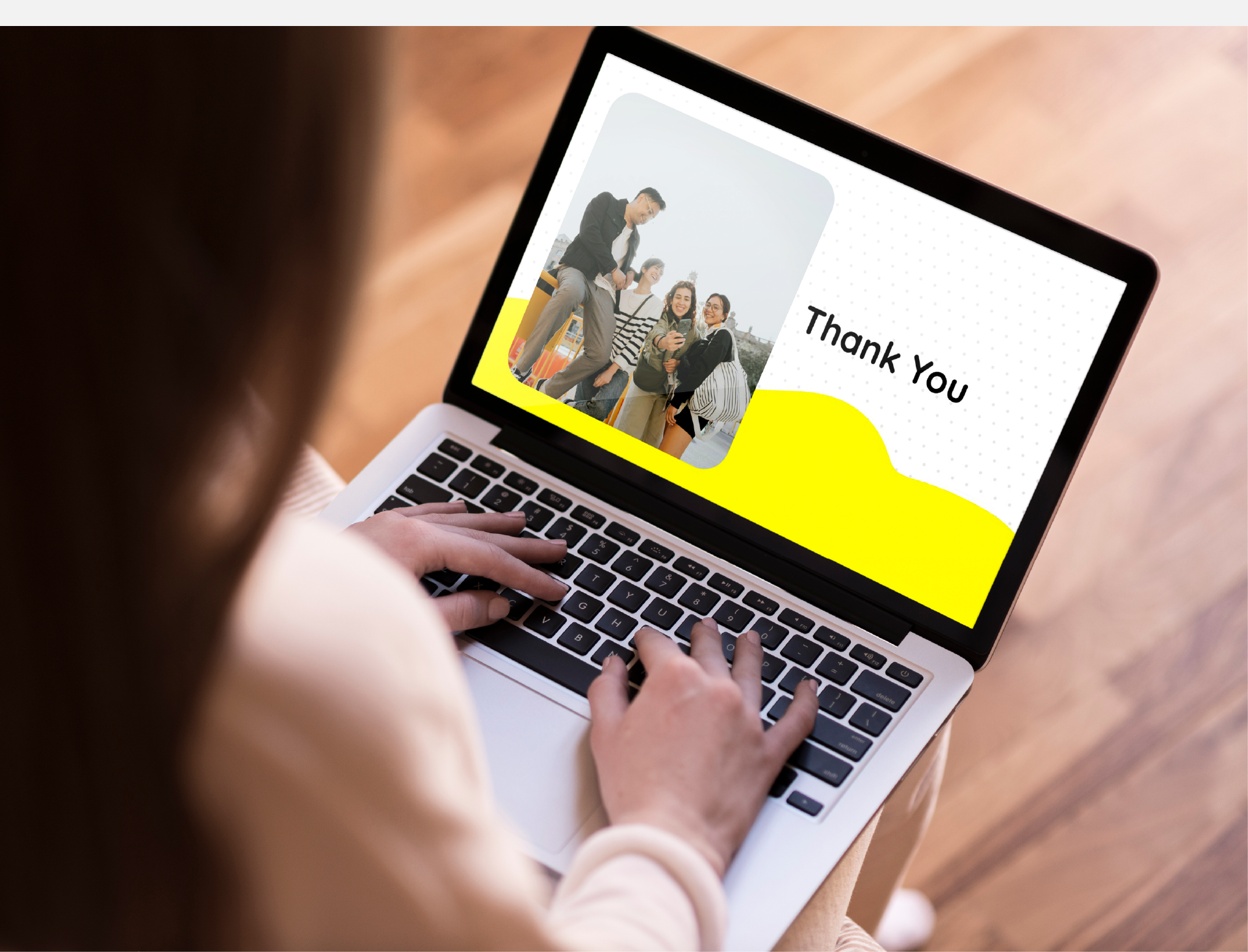
The deck was designed to reflect Loop Agency’s DNA: bold, approachable, and future-focused. A clean structure, minimal layout and high-impact visuals allow the content to breathe, making the communication feel smart yet human. The goal: create a seamless experience that feels both strategic and energizing.
Image Selection
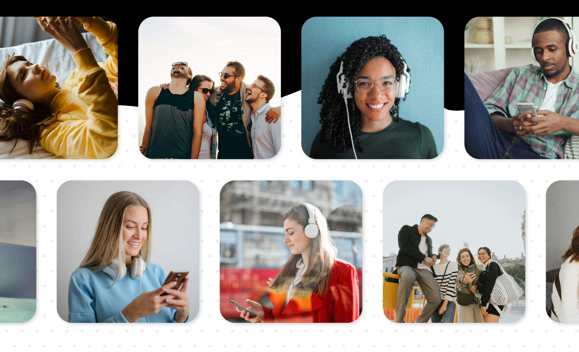
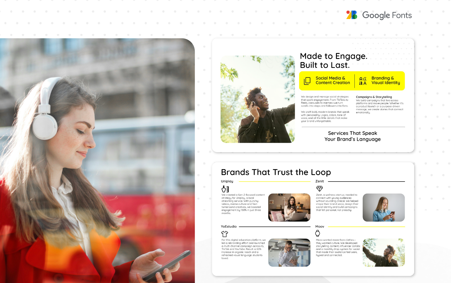
We chose candid, real-life imagery that captures authentic moments and expressions. This helps reinforce the agency’s people-first philosophy, bringing warmth and relatability to a corporate context. The imagery feels spontaneous—but it’s purposeful, reflecting modern, digital-native culture.
Typography
Quicksand was chosen for its soft geometric shapes and friendly appearance. It conveys a sense of modernity, clarity, and warmth—perfect for a brand that wants to sound professional without feeling rigid. Its rounded forms and balanced proportions support a welcoming, youthful tone.
Color Palette
The color palette uses vibrant yellow as a signature tone — symbolizing energy, optimism, and creativity. It’s balanced with neutrals like white and charcoal. The result is a visual identity that feels confident, playful, and professional.