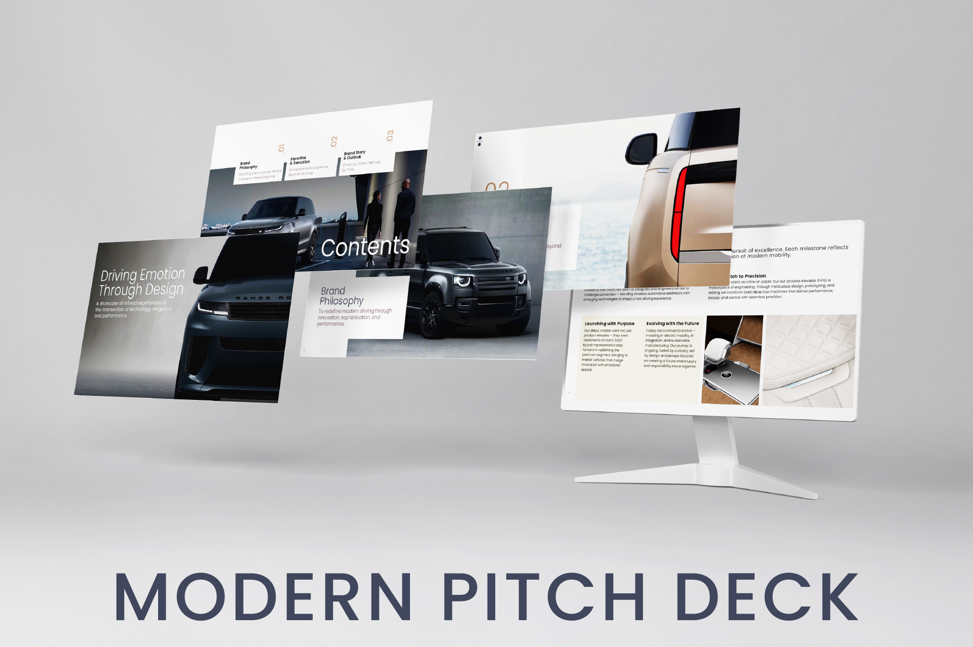
Modern Pitch Deck
Concept
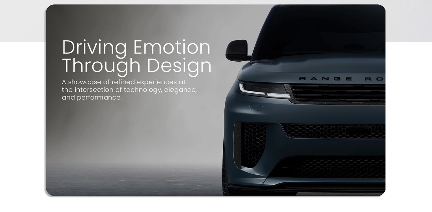
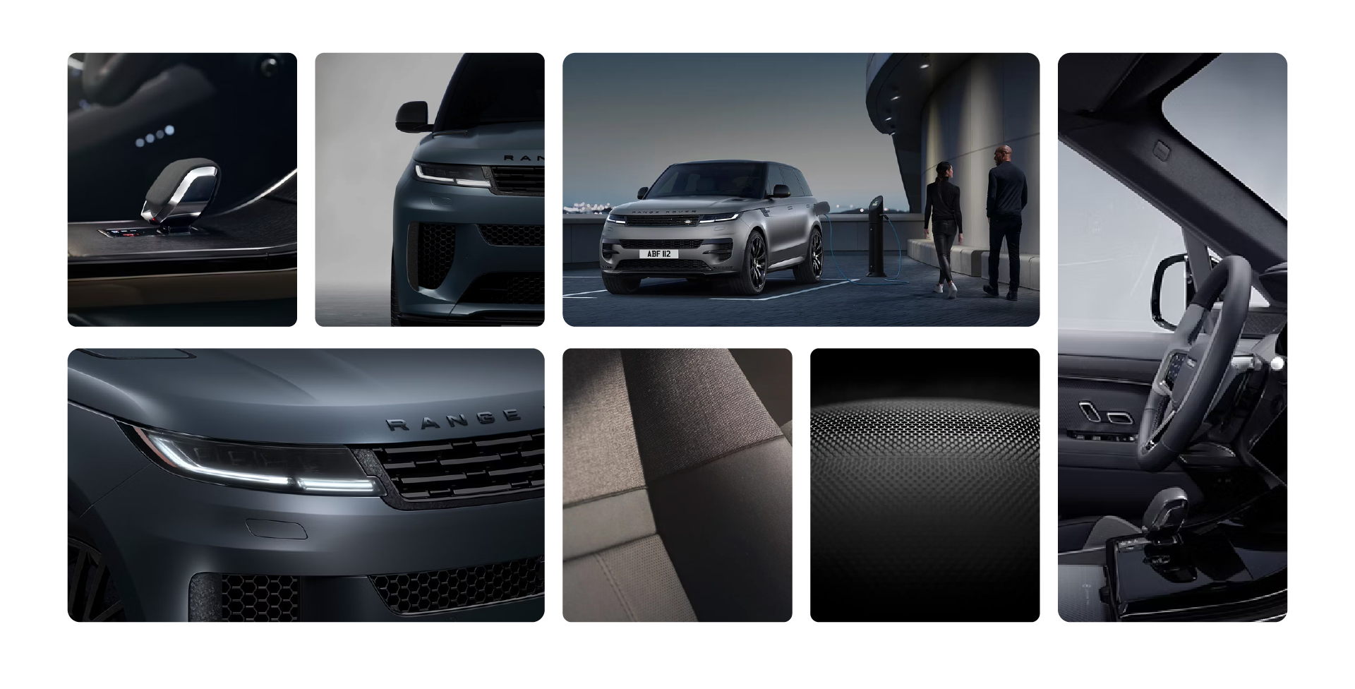
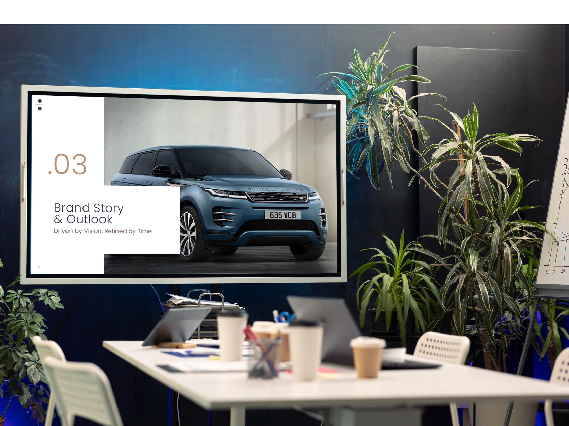
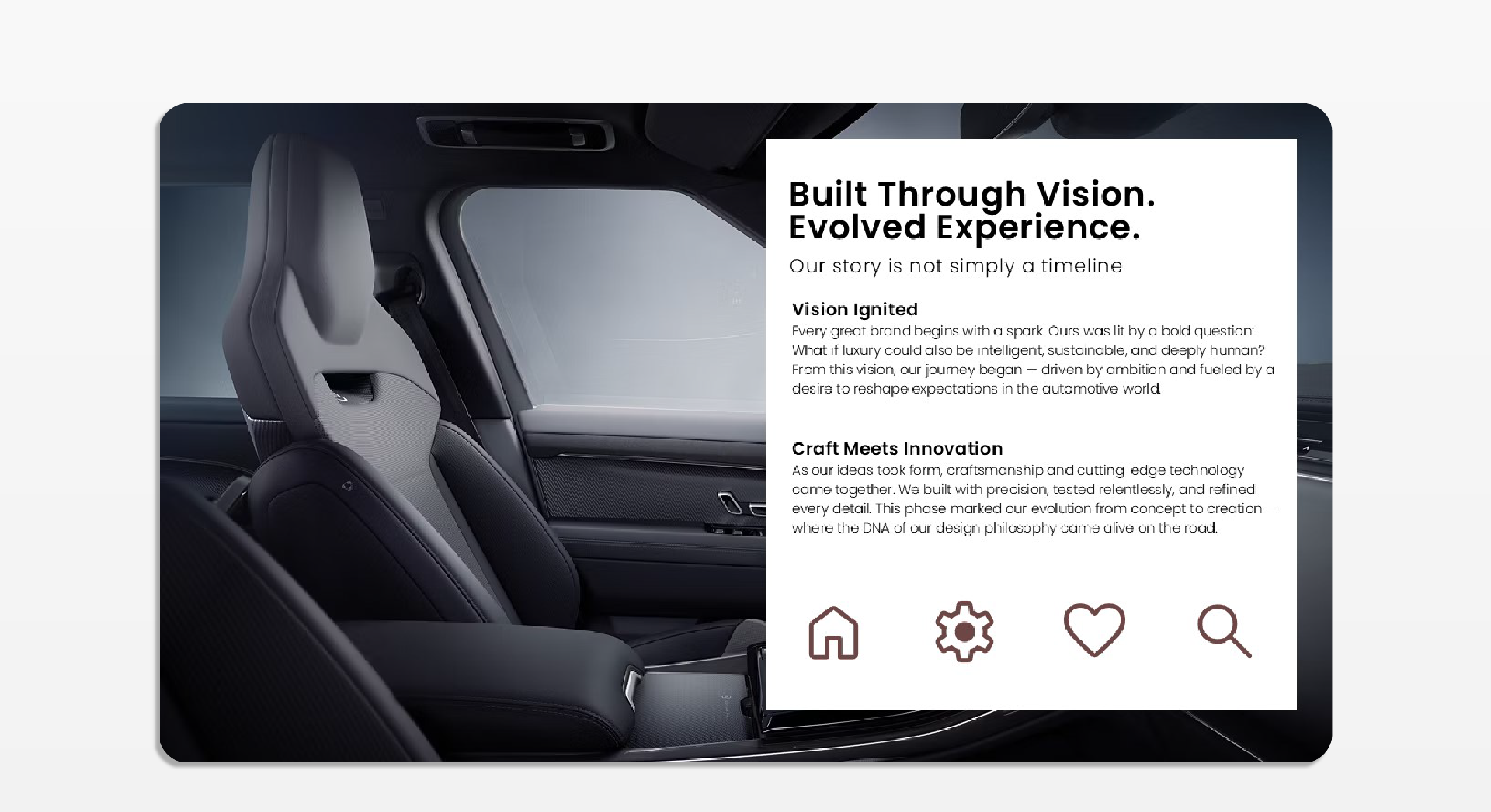
The deck features a clean, modern, and sophisticated design, designed to convey a premium aesthetic. Visual clarity is prioritized through a structured grid, ample use of white space, and a warm, neutral color palette that reinforces the elegance of the content. The Poppins typeface provides versatility and legibility, accompanying a coherent visual narrative that balances text and image with harmony and functionality.
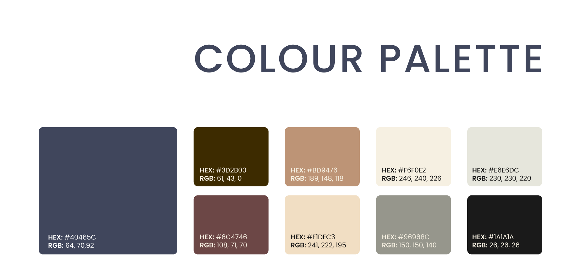
Colour Palette
The chosen palette combines sober, earthy, and warm tones that convey sophistication, confidence, and naturalness. The browns and beiges evoke noble materials and organic textures, while the grays and blues provide visual balance and a sense of elegant technology. This combination achieves a visual harmony that reinforces the product's premium identity, allowing both images and fonts to stand out without competing with each other.
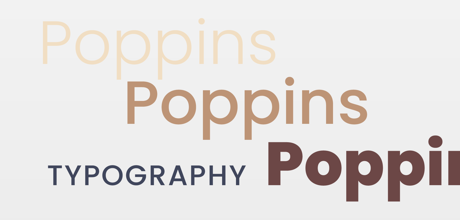
Typography
Poppins is a geometric, modern, and versatile typeface that strives for clarity, cleanliness, and professionalism. As a free Google font, it allows for easy implementation and compatibility in various digital environments while maintaining visual consistency.